The purpose of this project was to create an interactive cookbook of Pharmacometric plots created with the popular R visualization library ggplot2 to increase efficiency and empower users to leverage the powerful customizations offered by ggplot2. Though the ggplot2 package is powerful and versatile, coding each plot can become tedious and remembering customizations can be difficult. Certain solutions have been proposed, but most involve ‘cookbooks’ of premade plots flush with customizations. GGvisualizer acknowledges the iterative (including wrong interations!) nature of development, and offers a way of capturing the steps.
The step-by-step differences provide insight into the specifics of how each snippet of code impacts the final plot, offering the ability to extend the examples to user-specific scenarios. The creation of the diffr package further extends this concept to users interested in creating their own examples, and addresses one of the biggest pain points of ggplot2 – finding and understanding the various customizations offered.
Go check out some samples of the output at ggvisualizer
Each ggvisualizer is made up of a couple key components:
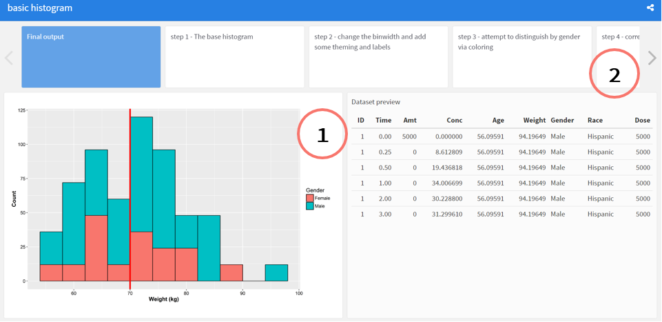
1.Users are presented with the final plot and a snippet of the data used to generate the plot, offering a reproducible final example to play with.
How are these made? It’s mostly some light syntactic sugar on-top of Rmarkdown and flexdashboard
A combination of the steps might look like:
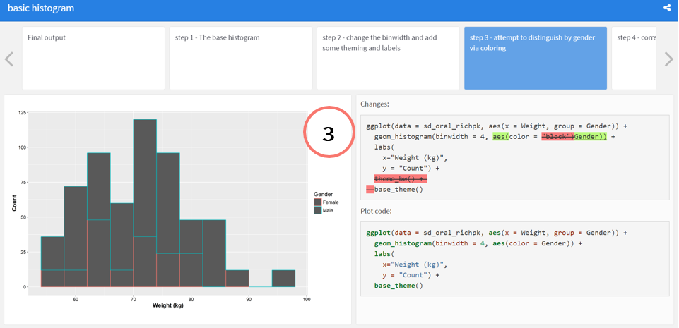
### step 3 - attempt to distinguish by gender via coloring
@start step3
```{r }
ggplot(data = sd_oral_richpk,
aes(x = Weight, group = Gender)) +
geom_histogram(binwidth = 4, aes(color = Gender)) +
labs(
x="Weight (kg)",
y = "Count") +
base_theme()
```
@end step3
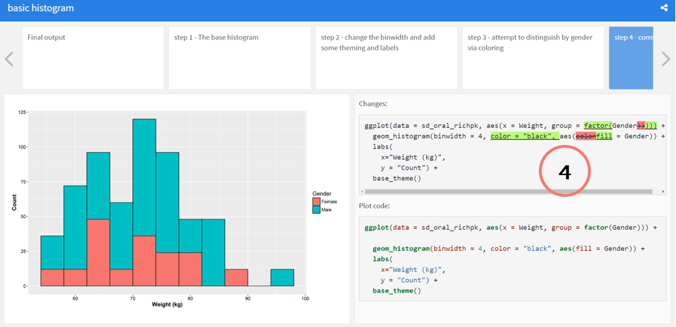
### step 4 - correct the color to use fill
@start step4
```{r }
ggplot(data = sd_oral_richpk,
aes(x = Weight, group = factor(Gender))) +
geom_histogram(binwidth = 4,
color = "black",
aes(fill = Gender)) +
labs(
x="Weight (kg)",
y = "Count") +
base_theme()
```
@end step4
…
The decorators @start and @end delineate rmarkdown code chunks that should be diff’d. Currently, this is done by an experimental package, diffr (available at github.com/dpastoor/diffr),
which will parse the chunks, inject html code including coloration, and strip the extra decorators, and add the necessary pieces to be a flexdashboard,
allowing the resulting rmarkdown to be knit.
Feel free to check it out, at ggvisualizer, and leave comments if you’d like to contribute some plot(s) yourselves.
Finally, a special shoutout to Neha Mehta, who has been instrumental in brainstorming ideas and getting the initial plots created.